Cohesity
Cohesity
Repositioning a tech brand to shift perception
Repositioning a tech brand to shift perception
Design and Art Direction
Strategy and Messaging
Creative Consulting

Repositioning and Rebrand
Repositioning and Rebrand
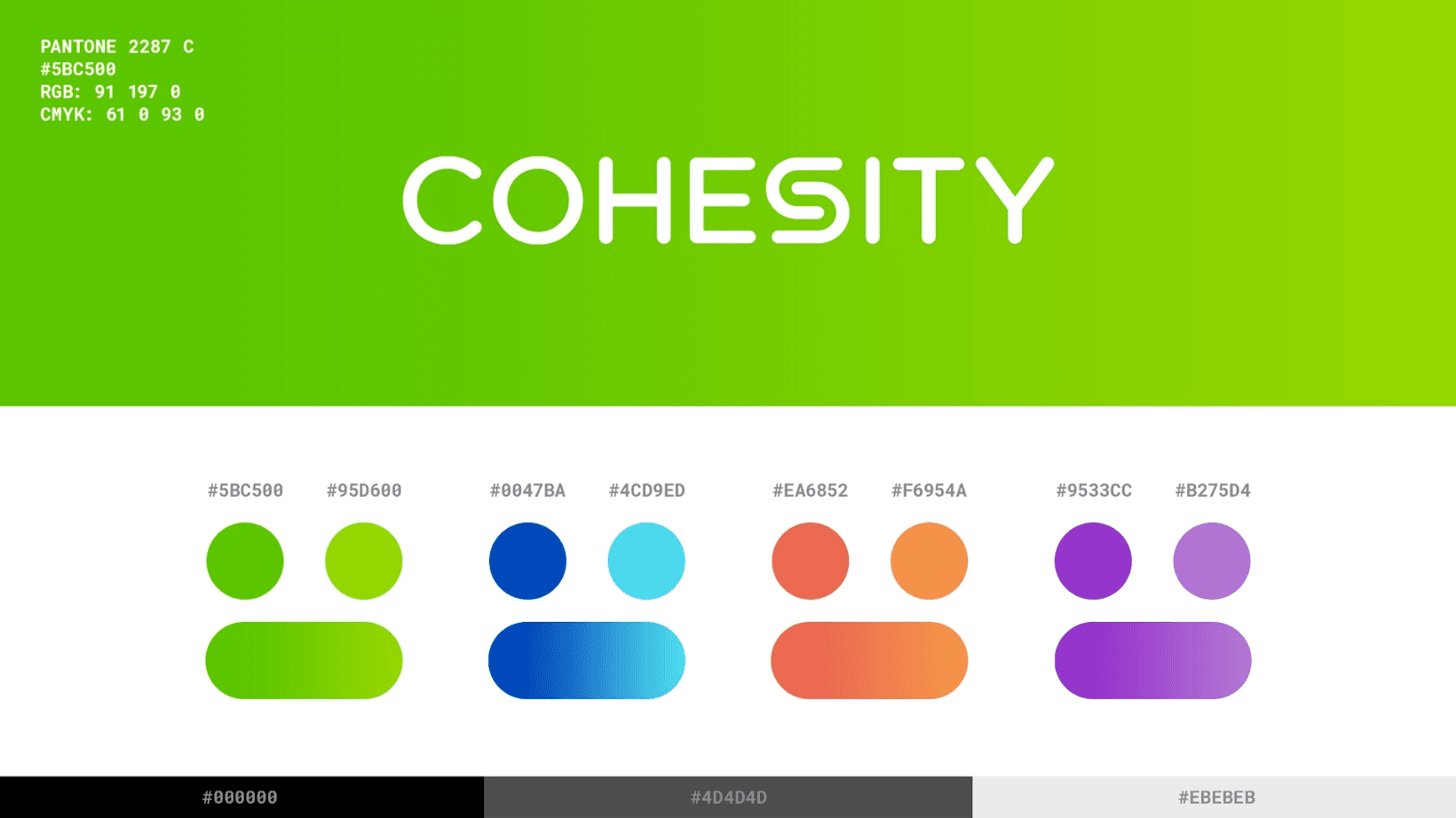
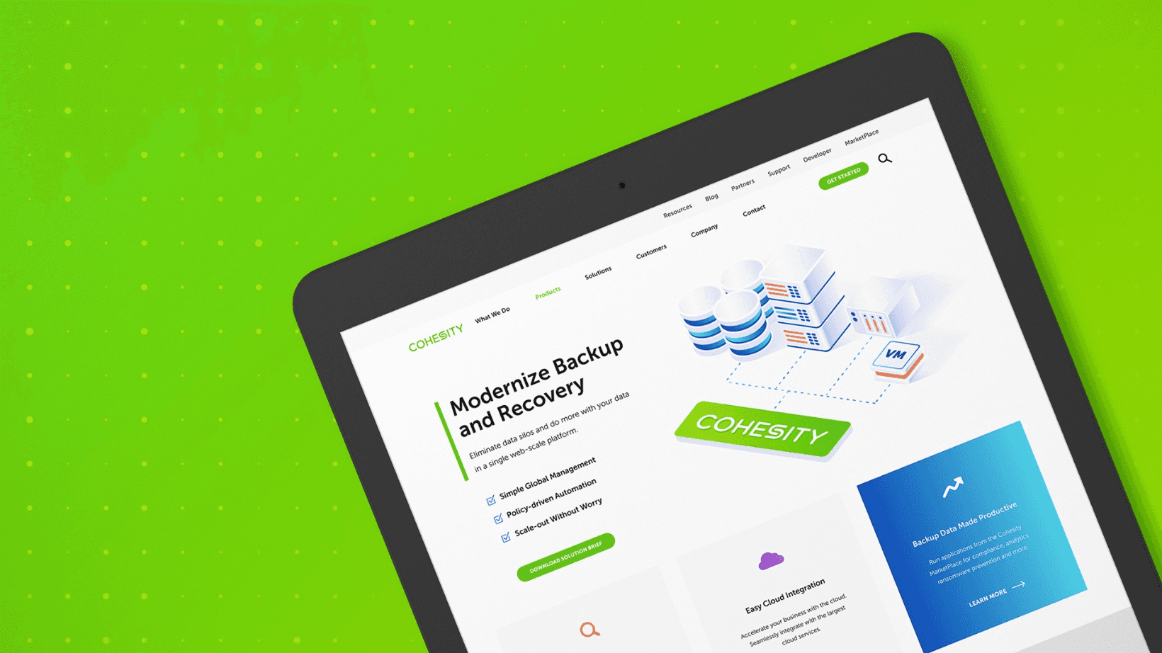
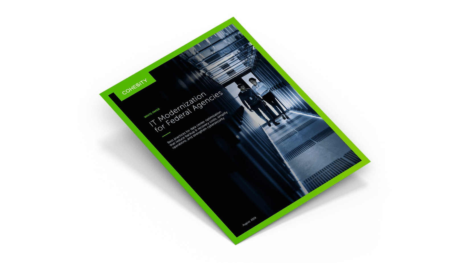
Cohesity started out as a data backup and archive product, but as the company transitioned into a broader data management platform, its brand perception hadn't caught up. We led a rebrand to help new and existing customers understand what Cohesity had become.
Cohesity started out as a data backup and archive product, but as the company transitioned into a broader data management platform, its brand perception hadn't caught up. We led a rebrand to help new and existing customers understand what Cohesity had become.







Big ambition. Small signal?
Let's close the gap.
Big ambition. Small signal?
Let's close the gap.