Hitachi Vantara
Hitachi Vantara
Creating a strong visual system for a versatile brand
Creating a strong visual system for a versatile brand
Strategy and Messaging
Design and Art Direction
Creative Consulting
Hitachi Vantara Global Rebrand
Hitachi Vantara Global Rebrand
Creating a strong visual system for a versatile brand
With many stories to tell, Hitachi Vantara needed a versatile visual system that would say it all, beautifully.
With many stories to tell, Hitachi Vantara needed a versatile visual system that would say it all, beautifully.

Hitachi Vantara Global Rebrand
The Challenge
The Challenge
Signal had long worked with the data solutions leader to answer key questions: Who are we? How do (and should) we show up in the world? Sounds easy enough; young, plucky companies still dive into these with enthusiasm. But add 100 years of global brand equity, and suddenly you have an extremely delicate and far-reaching balance to maintain.
Signal had long worked with the data solutions leader to answer key questions: Who are we? How do (and should) we show up in the world? Sounds easy enough; young, plucky companies still dive into these with enthusiasm. But add 100 years of global brand equity, and suddenly you have an extremely delicate and far-reaching balance to maintain.

Hitachi Vantara Global Rebrand
The Solution
The Solution
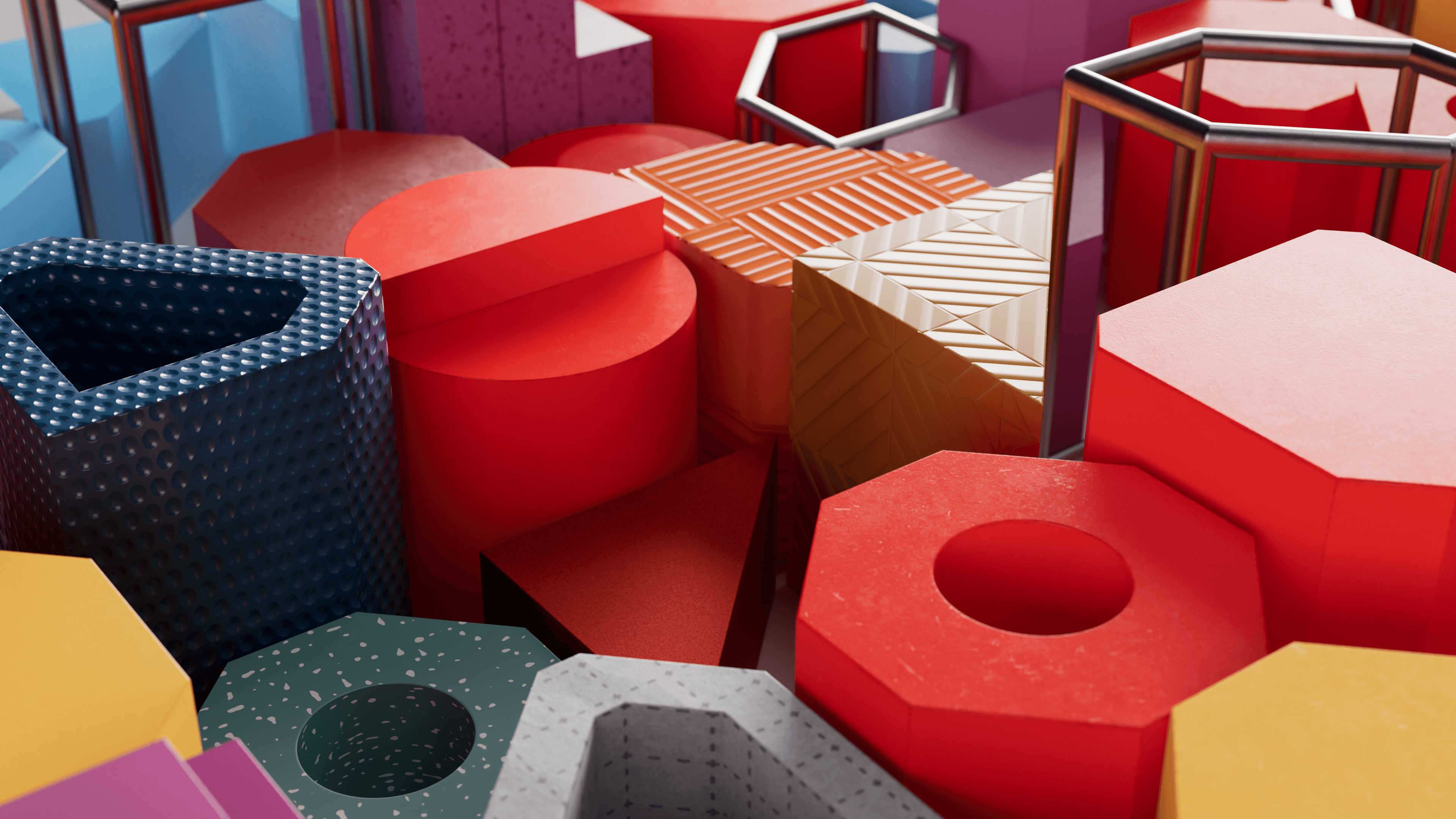
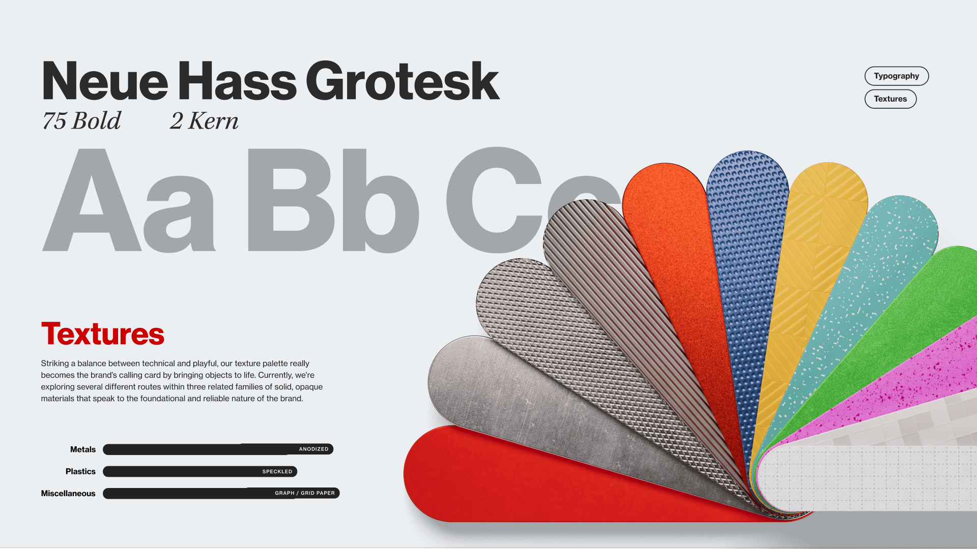
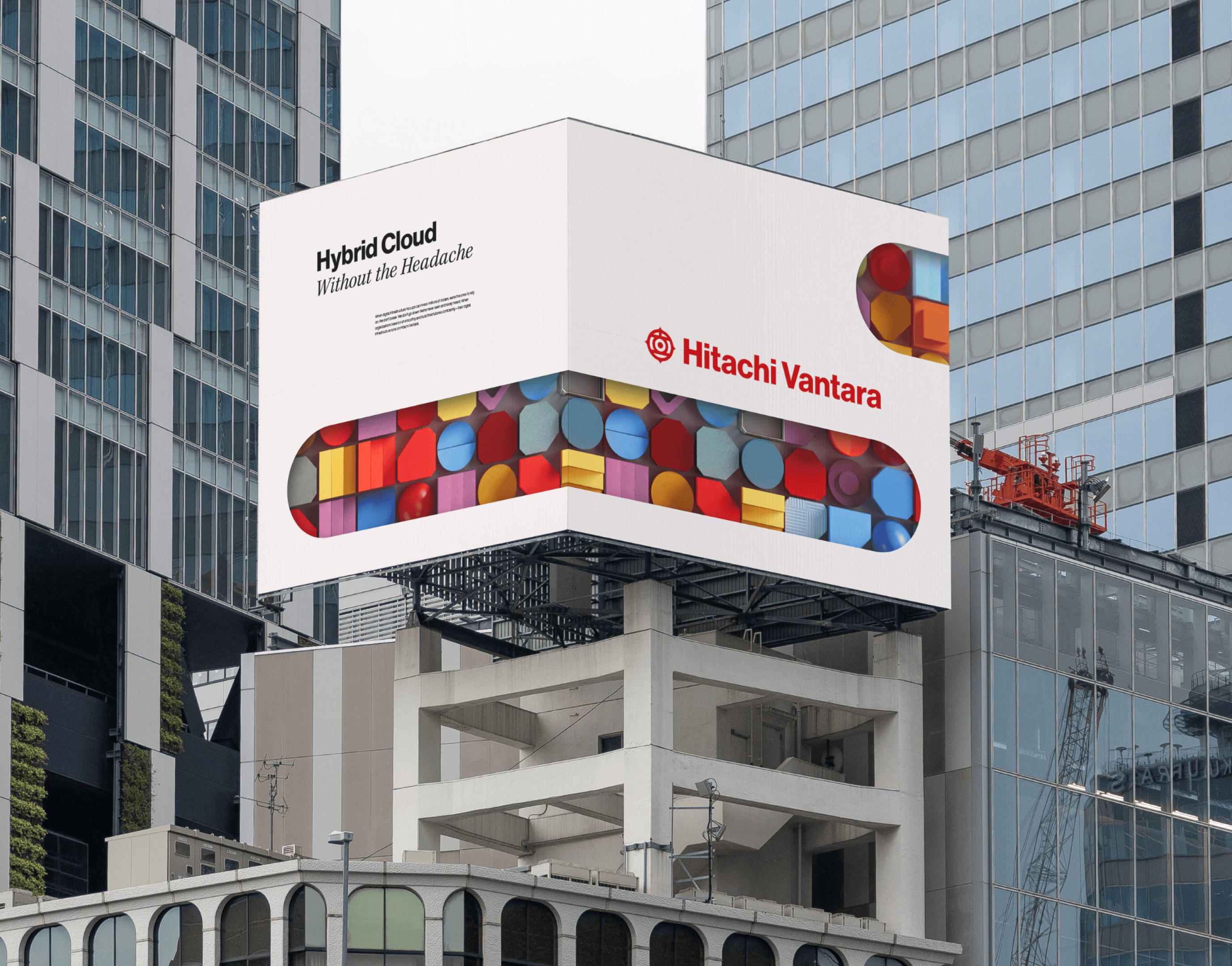
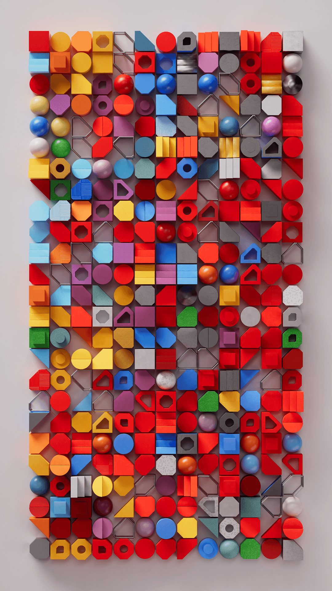
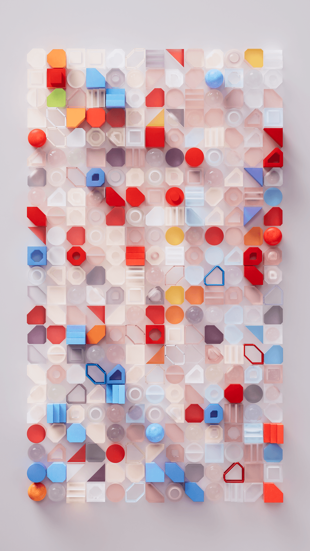
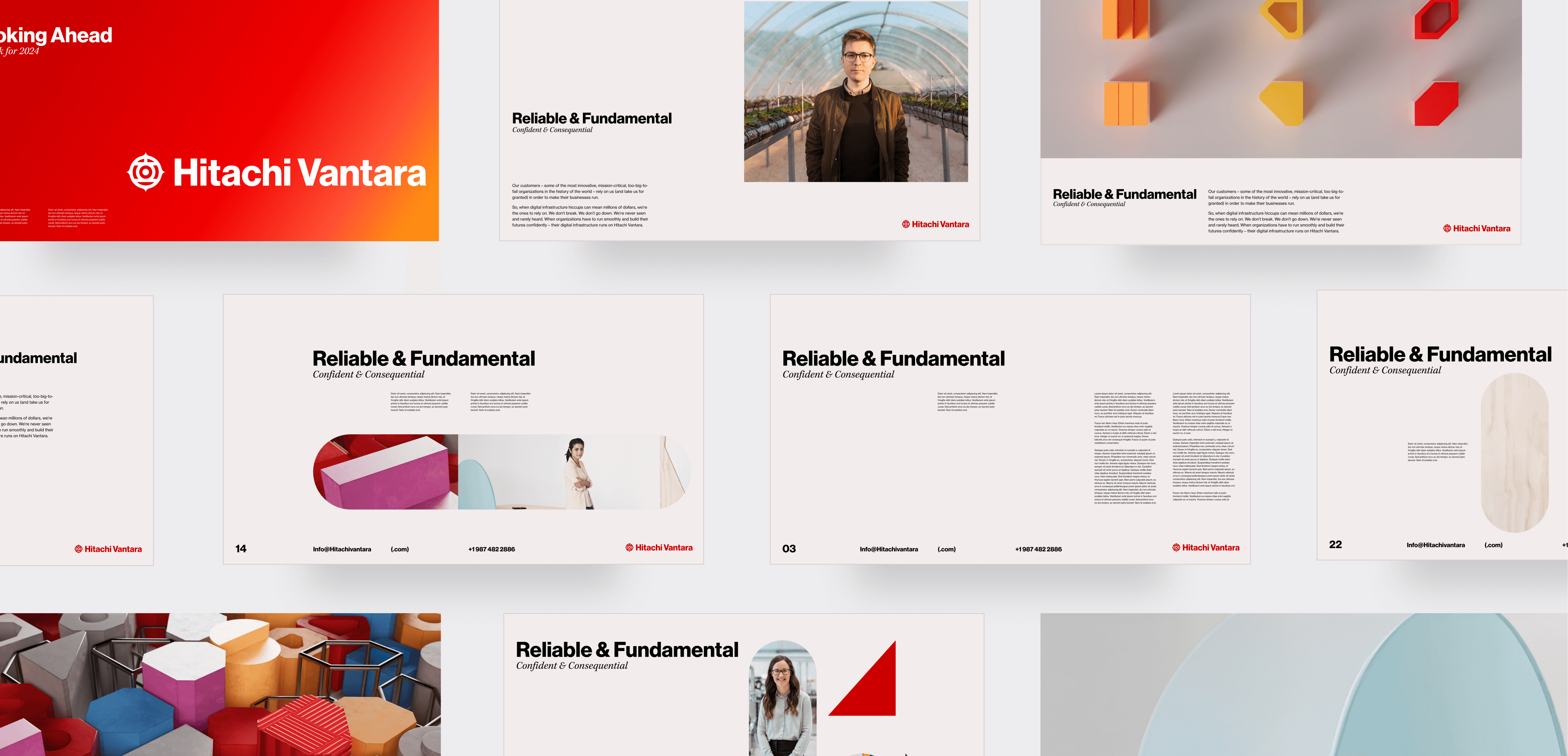
We set out to design an adaptable visual system to personify and flex across three brand pillars. We developed a visual direction that wouldn't be locked into communicating a specific product or service. Instead, it embodied the brand in a way that was flexible enough to make a powerful statement in any conversation. These evolved parametric shapes transcend their physical form and function as image coders, patterns, storytelling devices, and more – across all three visual directions.
We set out to design an adaptable visual system to personify and flex across three brand pillars. We developed a visual direction that wouldn't be locked into communicating a specific product or service. Instead, it embodied the brand in a way that was flexible enough to make a powerful statement in any conversation. These evolved parametric shapes transcend their physical form and function as image coders, patterns, storytelling devices, and more – across all three visual directions.

What Clients Said
What Clients Said
"Signal means the world to me. I can’t begin to describe how vital they are to our team and our brand. The strategic and creative direction they provide directly impacts – and improves – our global brand."
"Signal means the world to me. I can’t begin to describe how vital they are to our team and our brand. The strategic and creative direction they provide directly impacts – and improves – our global brand."
Next Project
Next Project


Big ambition. Small signal?
Let's close the gap.
Big ambition. Small signal?
Let's close the gap.